Ice Cream App COMPOSE UI UX
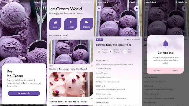
Ice Cream App android COMPOSE UI UX, where you can display your ice cream collection. In the application, you will find many screens: Splash Screen, Categories Screen, Details Screen, and Custom Dialog Screen.
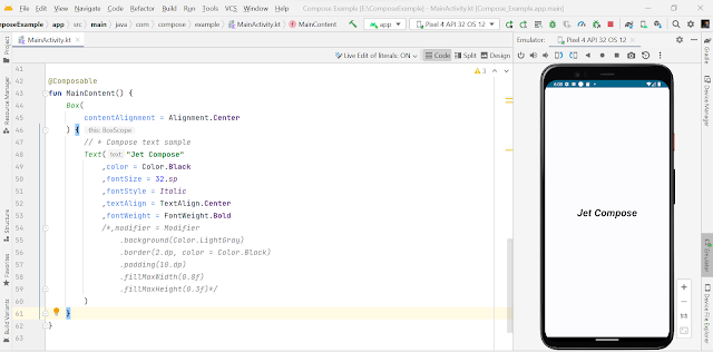
Text composable function is used to display text.
package com.compose.example

import android.os.Bundle
import androidx.activity.ComponentActivity
import androidx.activity.compose.setContent
import androidx.compose.foundation.layout.Box
import androidx.compose.foundation.layout.fillMaxSize
import androidx.compose.material3.MaterialTheme
import androidx.compose.material3.Surface
import androidx.compose.material3.Text
import androidx.compose.runtime.Composable
import androidx.compose.ui.Alignment
import androidx.compose.ui.Modifier
import androidx.compose.ui.graphics.Color
import androidx.compose.ui.text.font.FontStyle.Companion.Italic
import androidx.compose.ui.text.font.FontWeight
import androidx.compose.ui.text.style.TextAlign
import androidx.compose.ui.unit.sp
import com.compose.example.ui.theme.ComposeExampleTheme

class MainActivity : ComponentActivity() {

    override fun onCreate(savedInstanceState: Bundle?) {
        super.onCreate(savedInstanceState)
        setContent {
            ComposeExampleTheme {
                Surface(
                    modifier = Modifier.fillMaxSize(),
                    color = MaterialTheme.colorScheme.background
                ) {
                    MainContent()
                }
            }
        }
    }
}


@Composable
fun MainContent() {
    Box(
        contentAlignment = Alignment.Center
    ) {
        // * Compose text sample
        Text("Jet Compose"
            ,color = Color.Black
            ,fontSize = 32.sp
            ,fontStyle = Italic
            ,textAlign = TextAlign.Center
            ,fontWeight = FontWeight.Bold
            /*,modifier = Modifier
                .background(Color.LightGray)
                .border(2.dp, color = Color.Black)
                .padding(10.dp)
                .fillMaxWidth(0.8f)
                .fillMaxHeight(0.3f)*/
        )
    }
}
..


