Ice Cream App COMPOSE UI UX
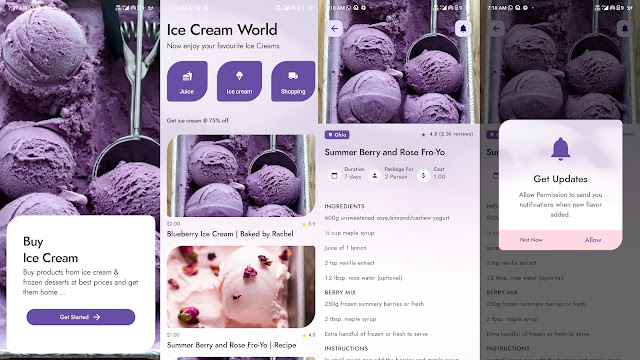
Ice Cream App android COMPOSE UI UX, where you can display your ice cream collection. In the application, you will find many screens: Splash Screen, Categories Screen, Details Screen, and Custom Dialog Screen.
This example demonstrates how to make custom dialog in android jet compose.
package com.compose.example

import android.os.Bundle
import androidx.activity.ComponentActivity
import androidx.activity.compose.setContent
import androidx.compose.foundation.layout.Box
import androidx.compose.foundation.layout.fillMaxSize
import androidx.compose.material3.Button
import androidx.compose.material3.MaterialTheme
import androidx.compose.material3.Surface
import androidx.compose.material3.Text
import androidx.compose.runtime.Composable
import androidx.compose.runtime.mutableStateOf
import androidx.compose.runtime.remember
import androidx.compose.ui.Alignment
import androidx.compose.ui.Modifier
import com.compose.example.ui.theme.ComposeExampleTheme

class MainActivity : ComponentActivity() {

    override fun onCreate(savedInstanceState: Bundle?) {
        super.onCreate(savedInstanceState)
        setContent {
            ComposeExampleTheme {
                Surface(
                    modifier = Modifier.fillMaxSize(),
                    color = MaterialTheme.colorScheme.background
                ) {
                    MainContent()
                }
            }
        }
    }
}


@Composable
fun MainContent() {
    val openDialogCustom = remember{ mutableStateOf(false) }

    Box(
        contentAlignment = Alignment.Center
    ) {
        // * Custom Dialog
        Button(
            onClick = {
                openDialogCustom.value = true
            },
            modifier = Modifier.align(Alignment.Center)
        ) {
            Text(text = "Custom Dialog")
        }
    }

    if (openDialogCustom.value) {
        CustomDialog(openDialogCustom = openDialogCustom)
    }
}

CustomDialog.kt
package com.compose.example

import android.annotation.SuppressLint
import androidx.compose.foundation.Image
import androidx.compose.foundation.background
import androidx.compose.foundation.layout.*
import androidx.compose.foundation.shape.RoundedCornerShape
import androidx.compose.material.Card
import androidx.compose.material3.MaterialTheme
import androidx.compose.runtime.Composable
import androidx.compose.runtime.MutableState
import androidx.compose.runtime.mutableStateOf
import androidx.compose.ui.Modifier
import androidx.compose.ui.graphics.Color
import androidx.compose.ui.graphics.ColorFilter
import androidx.compose.ui.layout.ContentScale
import androidx.compose.ui.res.painterResource
import androidx.compose.ui.text.font.FontWeight
import androidx.compose.ui.text.style.TextAlign
import androidx.compose.ui.text.style.TextOverflow
import androidx.compose.ui.tooling.preview.Preview
import androidx.compose.ui.unit.dp
import androidx.compose.ui.window.Dialog
import com.compose.example.ui.theme.Pink80
import com.compose.example.ui.theme.Purple40
import com.compose.example.ui.theme.Purple80
import com.compose.example.ui.theme.PurpleGrey40

@Composable
fun CustomDialog(openDialogCustom: MutableState<Boolean>) {
    Dialog(onDismissRequest = { openDialogCustom.value = false}) {
        CustomDialogUI(openDialogCustom = openDialogCustom)
    }
}

//Layout
@Composable
fun CustomDialogUI(modifier: Modifier = Modifier, openDialogCustom: MutableState<Boolean>){
    Card(
        //shape = MaterialTheme.shapes.medium,
        shape = RoundedCornerShape(10.dp),
        // modifier = modifier.size(280.dp, 240.dp)
        modifier = Modifier.padding(10.dp,5.dp,10.dp,10.dp),
        elevation = 8.dp
    ) {
        Column(
            modifier
                .background(Color.White)) {

            //.......................................................................
            Image(
                painter = painterResource(id = R.drawable.notification),
                contentDescription = null, // decorative
                contentScale = ContentScale.Fit,
                colorFilter  = ColorFilter.tint(
                    color = Purple40
                ),
                modifier = Modifier
                    .padding(top = 35.dp)
                    .height(70.dp)
                    .fillMaxWidth(),

                )

            Column(modifier = Modifier.padding(16.dp)) {
                androidx.compose.material3.Text(
                    text = "Get Updates",
                    textAlign = TextAlign.Center,
                    modifier = Modifier
                        .padding(top = 5.dp)
                        .fillMaxWidth(),
                    style = MaterialTheme.typography.labelLarge,
                    maxLines = 2,
                    overflow = TextOverflow.Ellipsis
                )
                androidx.compose.material3.Text(
                    text = "Allow Permission to send you notifications when new art styles added.",
                    textAlign = TextAlign.Center,
                    modifier = Modifier
                        .padding(top = 10.dp, start = 25.dp, end = 25.dp)
                        .fillMaxWidth(),
                    style = MaterialTheme.typography.bodyMedium
                )
            }
            //.......................................................................
            Row(
                Modifier
                    .fillMaxWidth()
                    .padding(top = 10.dp)
                    .background(Purple80),
                horizontalArrangement = Arrangement.SpaceAround) {

                androidx.compose.material3.TextButton(onClick = {
                    openDialogCustom.value = false
                }) {

                    androidx.compose.material3.Text(
                        "Not Now",
                        fontWeight = FontWeight.Bold,
                        color = PurpleGrey40,
                        modifier = Modifier.padding(top = 5.dp, bottom = 5.dp)
                    )
                }
                androidx.compose.material3.TextButton(onClick = {
                    openDialogCustom.value = false
                }) {
                    androidx.compose.material3.Text(
                        "Allow",
                        fontWeight = FontWeight.ExtraBold,
                        color = Color.Black,
                        modifier = Modifier.padding(top = 5.dp, bottom = 5.dp)
                    )
                }
            }
        }
    }
}


@SuppressLint("UnrememberedMutableState")
@Preview (name="Custom Dialog")
@Composable
fun MyDialogUIPreview(){
    CustomDialogUI(openDialogCustom = mutableStateOf(false))
}
implementation "androidx.compose.material:material:1.1.0-rc01"
implementation 'androidx.compose.material3:material3:1.0.0-alpha02'..