Ice Cream App COMPOSE UI UX
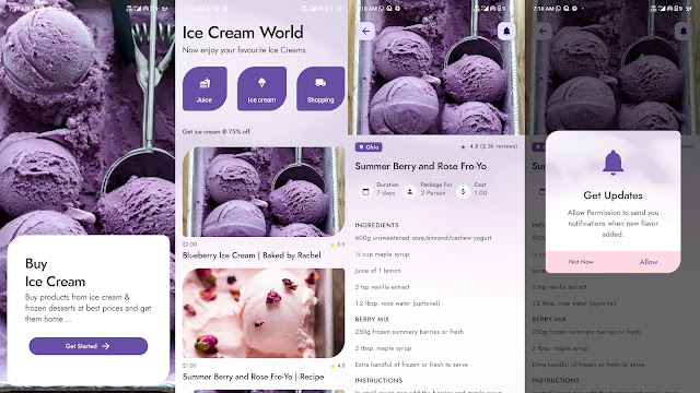
Ice Cream App android COMPOSE UI UX, where you can display your ice cream collection. In the application, you will find many screens: Splash Screen, Categories Screen, Details Screen, and Custom Dialog Screen.
This Button Jetpack Compose component has two compulsory attributes. OnClick and text.
package com.compose.example

import android.os.Bundle
import androidx.activity.ComponentActivity
import androidx.activity.compose.setContent
import androidx.compose.animation.animateColorAsState
import androidx.compose.foundation.layout.*
import androidx.compose.foundation.rememberScrollState
import androidx.compose.foundation.shape.CutCornerShape
import androidx.compose.foundation.shape.RoundedCornerShape
import androidx.compose.foundation.verticalScroll
import androidx.compose.material.icons.Icons
import androidx.compose.material.icons.filled.Favorite
import androidx.compose.material3.*
import androidx.compose.runtime.*
import androidx.compose.ui.Modifier
import androidx.compose.ui.graphics.Color
import androidx.compose.ui.unit.dp
import com.compose.example.ui.theme.ComposeExampleTheme

class MainActivity : ComponentActivity() {

    override fun onCreate(savedInstanceState: Bundle?) {
        super.onCreate(savedInstanceState)
        setContent {
            ComposeExampleTheme {
                Surface(
                    modifier = Modifier.fillMaxSize(),
                    color = MaterialTheme.colorScheme.background
                ) {
                    MainContent()
                }
            }
        }
    }
}


@Composable
fun MainContent() {
    Column(
        modifier = Modifier
            .padding(20.dp)
            .verticalScroll(rememberScrollState())
    ) {

        // * Button
        Button(onClick = { /* Do something! */ }) { Text("Button") }

        // * Elevated Button
        ElevatedButton(onClick = { /* Do something! */ }) { Text("Elevated Button") }

        // * Filled Tonal Button
        FilledTonalButton(onClick = { /* Do something! */ }) { Text("Filled Tonal Button") }

        // * Outlined Button
        OutlinedButton(onClick = { /* Do something! */ }) { Text("Outlined Button") }

        // * Text Button
        TextButton(onClick = { /* Do something! */ }) { Text("Text Button") }

        // * Button With Icon Sample
        Button(onClick = { /* Do something! */ }) {
            Icon(Icons.Filled.Favorite, contentDescription = "Localized description",
                modifier = Modifier.size(ButtonDefaults.IconSize))
            Spacer(Modifier.size(ButtonDefaults.IconSpacing))
            Text("Like")
        }

        // * Icon Button Sample
        IconButton(onClick = { /* doSomething() */ }) {
            Icon(Icons.Filled.Favorite, contentDescription = "Localized description")
        }

        //  * Icon Toggle Button Sample
        var checked by remember { mutableStateOf(false) }
        IconToggleButton(checked = checked, onCheckedChange = { checked = it }) {
            val tint by animateColorAsState(if (checked) Color(0xFFEC407A) else Color(0xFFB0BEC5))
            Icon(Icons.Filled.Favorite, contentDescription = "Localized description", tint = tint)
        }

        // * Button cut corner shape
        Button(
            onClick = { /*TODO*/ }
            , shape = CutCornerShape(topStart = 12.dp, bottomEnd = 12.dp)
        ) {
            Text(
                text = "Button cut corner shape",
                Modifier.padding(12.dp))
        }

        // * Rounded corners button
        Button(
            onClick = { /*TODO*/ }
            , shape = RoundedCornerShape(20.dp)
        ) {
            Text(
                text = "Rounded corners button",
                Modifier.padding(12.dp))
        }

    }
}

..


