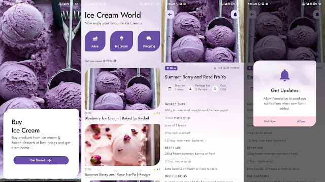
Material Components are interactive building blocks for creating a user interface.
Material is an adaptable system of guidelines, components, and tools that support the best practices of user interface design. Backed by open-source code, Material streamlines collaboration between designers and developers and helps teams quickly build beautiful products.
A bottom app bar displays navigation and key actions at the bottom of mobile screens
The top app bar displays information and actions relating to the current screen
Bottom navigation bars allow movement between primary destinations in an app
Buttons allow users to take actions, and make choices, with a single tap
A floating action button (FAB) represents the primary action of a screen
Cards contain content and actions about a single subject
Checkboxes allow the user to select one or more items from a set or turn an option on or off
Chips are compact elements that represent an input, attribute, or action
Date pickers let users select a date, or a range of dates
Dialogs inform users about a task and can contain critical information, require decisions, or involve multiple tasks
Menus display a list of choices on temporary surfaces
Navigation drawers provide access to destinations in your app
Radio buttons allow the user to select one option from a set
Bottom sheets are surfaces containing supplementary content that are anchored to the bottom of the screen
Sliders allow users to make selections from a range of values
Snackbars provide brief messages about app processes at the bottom of the screen
Switches toggle the state of a single setting on or off
Tabs organize content across different screens, data sets, and other interactions
Text fields let users enter and edit text
Time pickers help users select and set a specific time.

